.jpg?1579506649)
.jpg?1579506811)
Text description provided by the architects. Oxalis is located in 4L of Bohua Square, which is a French Restaurant. Shanghai Bohua Square is composed of a 60-story office tower and retail commercials. It is located next to the Shanghai Nature Museum. The Oxalis restaurant has a large terrace on the north side facing the Wusong River, which means there are great views. The roots of the “Oxalis” name can be traced to 2008, at Restaurant BRAS when Chef Jonas started to work with Michel BRAS where together with the kitchen team, he foraged herbs, plants & flowers in fields around the restaurant. Oxalis was one of the first herbs he foraged. Chef Jonas defines this restaurant as “Bistronomy”, which means the fusion of a pub and food.
.jpg?1579506706)
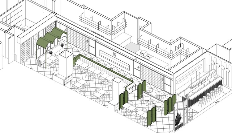
The interior design of Oxalis is inspired by the French farmyards and the chef's philosophy of food, rooted in the seasons and nature. So we use modern design language to tell a ‘Glowing Mysteries’, and move the French farmyard into the commercial space. The bright spatial tone, rattan, wood and white marble create a relaxing dining atmosphere for the restaurant.
.jpg?1579506824)
Growing means going beyond the original. In the bar, dining area, and private room, we use the extension of the material as the growth image, extending the same material from the ground to the wall, from the wall to the top, from the inner space to the outer space. They are both conspicuous and harmonized.
.jpg?1579506561)
From Reception to the private dining room, the ubiquitous curved and rattan elements set a relaxed tone for the restaurant. The arc at the top is inspired by the curved roof of the greenhouse, which gives ‘growth’ tenderness and soft protection.
.jpg?1579506576)
Reception also sets as a partition, the rattan and plants in the reception make the interior of the restaurant seem looming.
.jpg?1579506840)
The dark color of the entrance bar area is different from the relaxed and bright color tone in the dining area. We designed a darker environment for drinking and talking in the bar area. The black bar over 4 meters long and the green hand-made bricks on the wall are matched with marble countertops and ceramic murals behind the shelves.
.jpg?1579506784)
.jpg?1579506544)
During the day, the floor-to-ceiling windows make the interior view to the outside without any obstruction. The cool skylight collides with the warm light in the restaurant in the main dining area and penetrates each other, making the space a unique freshness and relaxation.


At night, the 2700k basic lighting in the space makes the neutral color of the wall and the ground show another soft and warm atmosphere in the warm light. Pendants use frosted glass ball lights from the New Works to ensure that soft light reaches every white marble tabletop.
.jpg?1579506590)
The long couch in the middle of the main dining area uses rattan for the back and sides, while the cushion cover features a bright green fabric from Gabriel. The combination of the material and color of the plants also adds vitality to the dining space. Behind the log couch is the open kitchen where you can see the busy figure of the chefs from the perspective of each guest in the dining area.
.jpg?1579506661)
At the end of the dining area, there are two sets of seats under the curved rattan roof, creating a strong sense of inclusion from the back and top, which gives guests a more intimate dining space. At the end of the restaurant, there are two sets of seats under a set of curved rattan ceilings, creating a strong sense of inclusion from the back and top, creating a more intimate dining space.
.jpg?1579506755)
The private room is only 16 square meters. The transparent design of the wine cellar and the combination of multiple materials eliminate the tension of the confined space in the visual sense. The other three are covered with ceramic murals, making guests feel like dining in the forest. The illuminating rattan embossed in the middle of the main background wall also gives the private room an elegant background.
.jpg?1579506730)
It is worth mentioning that we are fortunate to cooperate with young illustrator Wang Zhe. She was invited to create murals for Oxalis's 12-meter-long, 2-meter-high interior wall with the theme of “Reiki Plants and Animals”. Her style is lively and vivid, full of imagination, and coincides with the new French style defined by Oxalis. From the bar at the entrance to the private room, this series of paintings is presented in the form of ceramic murals, which are novel and chic, while creating a wonderful dining atmosphere. The plants in the picture are inspired by the common fruits and vegetables and herbs in Europe. These rustic outlines and colors make the picture full of vitality. The inconspicuous little insects make the picture more vivid, and the surprise is that the chef's cat also unexpectedly appears in the picture. Delicious food is always accompanied by fun, isn't it?
.jpg?1579506620)


.jpg?1579506706)
.jpg?1579506824)
.jpg?1579506561)
.jpg?1579506755)
.jpg?1579506649)
.jpg?1579506706)
.jpg?1579506811)
.jpg?1579506620)
.jpg?1579506840)
.jpg?1579506590)
.jpg?1579506576)
.jpg?1579506679)
.jpg?1579506730)


